Wednesday, May 27, 2015

The Kitchens - Before and After

I get a lot of questions about the kitchens we've redone in these houses.  A local realtor told me I have a 'Signature Style' - which I thought was pretty funny, because I try to make each one unique!

But since it's so hard to search this blog to just see kitchens, I thought I'd pull all the Before & Afters  into one simple post.  There's a link to each one if you want to see more details, plans or information.  And I'll let you decide if there is a real Signature Style to them!

Cherished Bungalow Kitchen

While the highlight of this kitchen was the antique sink - new cabinets,  reclaimed wood, and a pantry with an antique door made it extra special!  Click here to see all the photos


Gracious Gambrel

Taking a tired 1980's style kitchen (in a 1930's home) into the 21st century was a huge undertaking - but what a difference!  By removing the dark cabinets and peninsula and replacing it with a large island and custom banquette, this kitchen is now, truly, the heart of the home.  Want to see more?  Click here


 1900 Victorian Kitchen


This was the first house we renovated and in many ways it was the simplest kitchen.  We only had to move a few things, get rid of the drop ceiling, the vinyl floor and add an island.  Oh, and eliminate all the old knob and tube electrical wiring and tear out a load bearing wall.  The floor was in rough shape, so we had new red birch installed to blend with the original floors.  And of course we installed new cabinetry, countertops and details.  Okay.....so maybe we did quite a bit of work!


Want to see the completed kitchen photos?  Click here.

Diamond in the Rough


Photo:  Jamie Salomon
On the other end of the complexity scale, was this 1930's kitchen.  This was one of our most dramatic transformations, in a foreclosure that had been vacant for a long time.  We had to move the bathroom out of the kitchen (the only bathroom in the house by the way), open up walls, find mysterious leaky pipes, rewire, replumb, move windows, you name it!  But when we were done - wow, what a change.  And the white and slate blue color palette really brightened up the former drab, dreary space.


Want to see more?  Click here for the kitchen design plan.  Click here for the before and after photos.

Ranch to Colonial Conversion


This kitchen was last updated in the early 70's.  It needed a dramatic update, so we removed the wall to the living room and tore out the dangerous staircase (door on the left) that led to the basement.  Suddenly it's a big open space, but has lots of traditional elements with salvaged antique beams, cream colored cabinets and Italian vintage style tile for the backsplash.
  Want to see more?  Click here.


New Englander


This 1892 kitchen had been updated a few times over the years.

My guess is the last time was in the 1980's.  For this update, we kept the efficient 'U' shaped layout and opened it up to the dining room, by removing a wall.  And in the process we discovered original wide pine flooring in the kitchen and a unique blend of maple and birch hardwood in the dining room.

Want to see more?  Click here for the design plan.  Click here for the before and after photos.

Craftsman Bungalow


Because we kept the maple cabinets in this bungalow (they were in nice shape) we thought it wasn't going to be a big job.  But we had to move/rework some of them and add some new details - including a custom made backsplash, refrigerator surround, period hardware and quartz countertops.  We also uncovered an original maple hardwood floor that had 1000 staples in it!  Finally, we changed the sunroom to make it a breakfast room, including a stainless steel island for additional prep space!


Want to see more?  Click here.


Beach Cottage


Only the door location stayed the same!
This one owner, post WWII cape cod got a major renovation - including a whole new second floor.  But the reno was just as dramatic on the first floor, with a new open concept layout.


Want to see more pictures?  Click here for the kitchen design plan.  And Click here for the Before & After photos.


Kitchens x 2 - The Duplex

What started as the same footprint in both units of the duplex, ended up in two different final designs.  Yet they share some similarities.  Do you like one better than the other?
Tenants Unit Before
Tenant's Unit After
Owner's Unit Before
Owner's Unit After

Want to see more?  Click here for the Tenant's Unit.  Click here for the Owner's Unit.

Of course there will be more kitchens in our future - so we'll be sure and update this list from time to time.  But I'm curious.....do you see a 'Signature Style'?

Want to see more of SoPo Cottage?  Like us on Facebook.


Pin It

Tuesday, May 19, 2015

Defining 'Rooms' in an Open Concept Floor Plan


As you probably noticed from the floor plans,  our first floor is essentially one big, open room.  That's probably taking 'Open Concept' to an extreme, but since we're downsizing and it's just the two of us, we wanted a big space for cooking, entertaining and relaxing.


But even with an open concept, we still wanted to designate 'rooms'.  One big space would be boring!  But how do we do that in a big space?   There are some tricks to clearly define different rooms.

First, we started by defining the foyer and dining room - they were part of the original footprint of the house.  So we used the original antique beams across the ceiling.  The hand hewn beams introduce a textural element with their original adze saw marks.  Of course they were a perfect fit - because they were original to that part of the house.  And it's such a fabulous nod to the history of the house!

Next, we looked at the kitchen space (click here for the kitchen design).  But that was easy!  The kitchen was naturally defined by the island, cabinets and pantry.  And since we have a large island planned, it clearly sets the boundaries of the kitchen.  Don't you love a big island?   It's so versatile - a great place to gather and chat with the cook.  Or for entertaining, it makes a great buffet space for all the food.

Finally, for the living room, we could use the staircase and surrounding walls to define the space.  And we wanted a feature wall, with built ins on the primary wall.  To make it cozy, we wanted a gas fireplace.  That helps keep us warm on those long Maine winters!   We planned custom bookcases to flank both sides - including natural cherry tops, to visually connect with the cherry butcher block on the kitchen island.  We put windows above the bookcases, to provide light, but because they sit so high - they provide privacy as well.  For the fireplace surround, we planned on using the same Walker Zanger Waterfall tile that we used in the kitchen - but in an elongated running bond pattern, with coordinating marble tiles on the hearth.
Living Room Wall
Once it's all completed, we will have that big open space, but will also have clearly designate 'rooms' for the living room, dining room and kitchen.  Stay tuned for more!


Pin It

Monday, May 11, 2015

Bathroom Design with a Sea Glass Color Scheme

We wanted to put a full bath on the first floor of the house.  With the nearby beach, that often means sandy dogs coming home from their walk and a first floor bathtub to clean them up seemed like a really smart idea.  Yes, it is all about the dogs!  But we also wanted to have an extra bathroom when we have a house full of guests.

I was thrilled when our contractor Joe called me to say he'd found an old clawfoot tub for $50!  Score!!


But I quickly learned that there were a lot of additional costs involved.  First, we had to refinish it ($350).  Then I had to find a faucet.  I wanted one with a handheld shower attachment (yup - better for dog washing).  Several years ago I'd bought a cheap one and within a year the hose broke and the kids ended up spraying gallons of water all over the bathroom.  So this time I was much smarter and bought a nice quality faucet, supply lines and matching shut off ($850 - geezz!).  Suddenly, my bargain tub wasn't looking like quite the bargain I had hoped for.


For the overall design, I wanted to stay with our beach cottage theme.  I wanted to use sea glass blue/greens.  I started with fabric for the window treatments and found this great design and color scheme from Maine Cottage.
Photo:  Maine Cottage


Next, I found this tumbled marble in sandy beige with sea glass inserts for the floor.  And it was on clearance because it was discontinued!  Seriously, I wish they still made this tile - I'd use it over and over.  It hides any sand that gets tracked into the room and the sea glass just seems to glow.  As you can see from the install photo, I wanted to do a 'rug' border with the pattern.


For the vanity, I found this beautiful glass top.  It wasn't the exact same color of sea glass blue as the floor, but the fabric helped pull all the colors together.  And in nature, sea glass comes in many shades of blue and green!


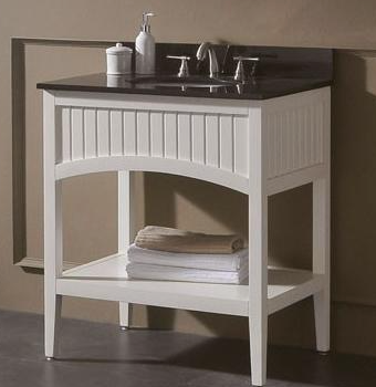
And to go with the glass top, I found this white vanity with bead board insets by Avanti.


Finally, for the walls, I wanted to continue the vintage cottage look.  So I decided to install bead board wainscotting.  It's also a great backdrop for the bathtub, which I wanted to paint a sea glass blue.

For the wall color,  I wanted a complimentary shade of blue above the bead board - to add to the color palette and to give a pop above the white bead board.

So - the design was complete.  Now we just needed to get far enough on the project to start installing it!


Pin It

Wednesday, May 6, 2015

Lucky Number 7 -The Duplex Before and After

I don't think we had any idea what we were getting into when we started on the duplex.  It was a foreclosure and I'd like to blame the lack of running water and electricity that kept us from seeing the warning signs!  But we certainly learned a lot about what can happen to a building that has been vacant for 4 years.  It takes quite a toll!

The challenges included a deck that was completely rotted away.


Asbestos on the pipes that cost a fortune to remediate to the EPA standards (it was a big job and included a surprise inspection from the EPA - story here).


Knob and tube wiring throughout (click here for the rest of the story).


A basement that looked like a wading pool in a heavy rain, which required regrading the entire yard.

And an additional kitchen install that we didn't originally plan on, due to lack of plumbing vents and crumbling walls when we jacked up the sagging floors.


But the finished product is a beauty!  As usual, Waterhouse Builders did a beautiful job.   Check out the 'Owner's Unit' in this video.


And here are the before and after photos of the 'Tenant's Unit'.

The living room and dining room were both nice sized rooms.  But they felt totally cut off from the kitchen, which was sequestered in the back of the house.   So we had some work to do to create a more open floor plan.

The solution was to move the antique china hutch a few feet to the right and eliminate a couple of walls (I make it sound so simple, they were load bearing and it was a lot of work!  The whole story is here).


Living Room with original stained glass window
And suddenly the whole space feels open and bright - particularly the hallway, which became big and open to the kitchen.


The kitchen was transformed, when we gutted the old space and updated it with new cabinetry, quartz countertops and a custom backsplash.  The only thing that stayed in the same place were the door and windows (although they were replaced with new, energy efficient ones).


With the custom marble and subway tile, light and open shelving installed


View towards the Dining Room - Before the hallway was opened up and the bedroom door closed to provide room for the range and butcher block peninsula.  


There were two small bedrooms off of the kitchen, which we decided to combine and create one large bedroom.  You can see them both in the photo to the left (gold and red!).
The finished bedroom is huge (12 x 20) with double closets and plenty of space for everything!


The first floor bathroom also got a complete upgrade.

But the biggest changes were upstairs.  We started with a dark small bedroom at the end of a dingy hallway - that got transformed into a master suite.


There was a surprising amount of unused space in the attic.  We decided to take advantage of it and increase the footprint of the space by 50%.

The master bedroom - before.  We opened up the far left wall, installed a skylight to make the space light and inviting, and installed new wall to wall carpeting (the old flooring was used on the first floor, to patch all the spaces from the wall removal).


The master bath - before (aka the attic space)

Much better than attic space - don't you think? 


And the renovations didn't stop on the interior.  We had to rip off the old decks and the scary staircase that ended in mid air and build two new decks with a balcony off of the other duplex unit (the full story is here).


The trim work on the deck makes it a real show piece.

We decided not to sell this house and rent it instead.  As you can probably guess, it didn't take us long to find renters!  Who can resist moving into a brand new space, with all the antique charm of the original?


Pin It
Related Posts Plugin for WordPress, Blogger...