Wednesday, August 26, 2015

Our Own SoPo Cottage - Before & After

Before we move to our next project, I thought it would be nice to share a recap of our own Cottage, including some photos you haven't seen before.

We started with a late 1800's house, that had been sorely neglected over the years.  Despite our best efforts to save it, the deterioration was so bad and there was so little original detail left, that it just didn't make economic sense to restore it.  So we salvaged the original hand hewn beams to use later and started anew.  This is the first, and hopefully only time, we've ever had to tear down a house.


Yes, the back of the house was a hodge lodge!
 Our goal?  A modest home that fit into the character of the neighborhood, with an open floor plan and modern conveniences.  We stayed within the original footprint, with just a small 11' x 11' addition to square up the house.

We love the resulting house.  It provides lots of room for family and friends - with low maintenance and a manageable yard.  What more can we ask for?

For the interiors, I'll start at the top and work down.  Our must have list included a deck on the third floor and after a lot of deliberation, we decided to create a home office and living space up there as well. (more photos, click here)
Ignore that dog tail on the left!!!


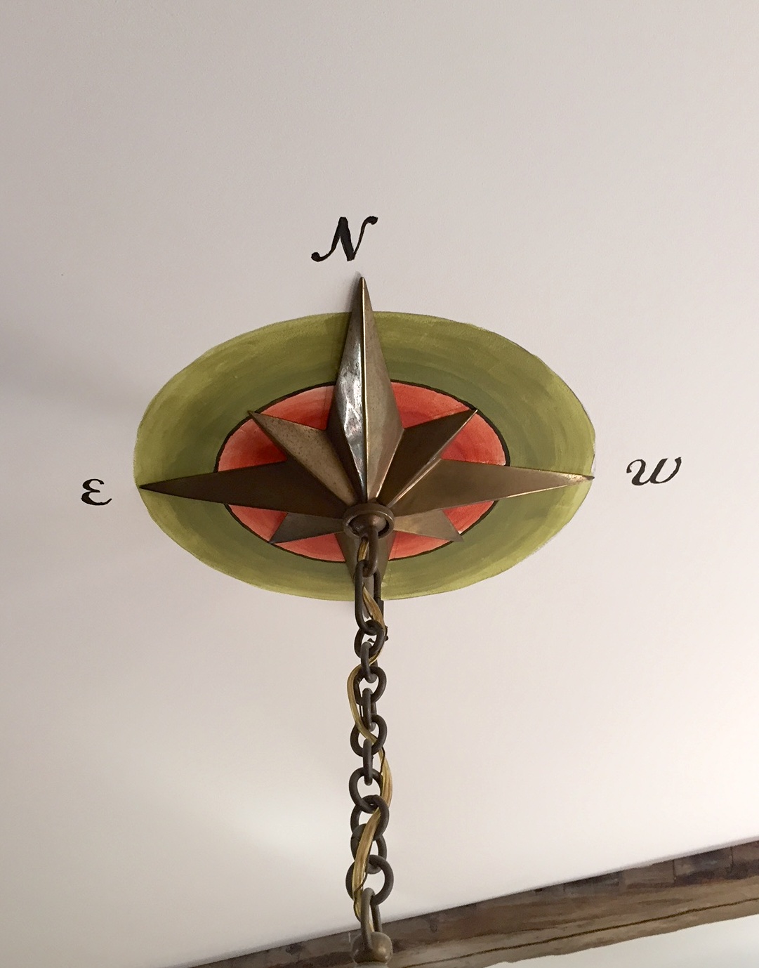
I love nautical charts as wallpaper!!


And while we love the office and adjoining sitting area, the deck is probably our favorite spot.  We're at the top of the hill, looking down over Casco Bay and the islands, and can't get enough of the views.


It's a fabulous perch, no matter what the weather and we spend a lot of time out there.
The see through railing was a must!

On the second floor, we have 3 bedrooms, with a generous landing and wide open staircase.

The back bedroom is ready for guests, with its own balcony and beautiful views (click here for more).
View from bedroom window - sea mist on a cold morning

 The front bedroom is a bit smaller, but cozy.

 The master suite is white with pops of bright color!
Master Bath
 And the family bath sports nautical stripes.
Family Bath

On the first floor, we designed an open concept living space, with our dream kitchen for people that like to cook (Click here and here for more photos!)


It was a challenging building process, with lots of surprises along the way (nothing like bankruptcy to add a little excitement).  But we're thrilled with the result and couldn't be happier!

Now - on to the next project.  And we have a big surprise for you :-)


Pin It

Tuesday, August 18, 2015

Our Own Open Concept Cottage: First Floor

So here's the thing.  At one point in our lives, we threw formal dinner parties, with fancy place settings and multi course meals.  But nowadays, the idea of hauling the silverware out and polishing it seems like too much work.  We do much more casual entertaining and everyone likes to gather in the kitchen to chat with the chef (that would be Richard, not me!).  We just want to throw everything in the dishwasher at the end of the evening!  Is this just a phase of our lives?  Or does everyone entertain more casually now?

So for our own house, we wanted to have the ultimate open concept floor plan  - essentially one big room, including the staircase.  That give us the maximum space for living and entertaining.  And it really suits our lifestyle.  To be honest, I'm not really sure where the silver is anymore!!
So here are the photos of our house.  The living room, dining room and kitchen all blend seamlessly.  With no walls, we have lots of space for people and pets (ha, yes, that's Petey in the photo below!  And the rug at the bottom of the steps?  That's because he likes to fly down the stairs and come to a screeching halt with his nails!).

Petey really wanted to be in the picture!
We spent a lot of time designing the fireplace wall to get the proportions right between the mantle, bookcases and windows.  In the end, it was worth all the planning, because we love how it came out.   It's reminiscent of Arts and Crafts homes, with windows high up on the walls.  And it mimics the kitchen with the white woodwork and cherry tops, as well as the marble fireplace surround and hearth.

In fact, we used the same marble and glass tile from the kitchen backsplash - but in an elongated running bond pattern around the gas fireplace.  These tiles also have slightly different thicknesses, which adds a nice 3 dimensional aspect.


The dining room has lots of windows, to bring in light all day long.  We reused the original antique beams across the ceiling.  They are a nice design element, but they also clearly designate where the original structure was . We love that nod to the house's history!  For dining, we've used a simple trestle table with a mix of chairs.


The light fixture might look familiar - we used the same one in our Craftsman Bungalow that we did last year.  The compass rose on the ceiling medallion is the perfect nautical touch.  Oh, and I discovered that painting above your head is incredibly difficult!


We bought the linen chest years ago at an antique shop in Pennsylvania.  It's an American chest that dates back to the early 1800's and it's one of my favorite pieces.

Mike Stiler Fish
The only downside to an open floor plan?  There aren't a lot of walls for artwork.  And of course the artwork and colors really bring the space to life.  We tried to use pieces by local artists, to really give our home a local flavor.
Catherine Breer and Margaret Ford
Jeff Barrett
This little guy just makes me happy!


There are quite a few doors in the open space - to the basement, the bathroom, the closet and of course outside! We wanted the staircase to be an integral part of the space.  It drove a lot of design considerations up to the 2nd and 3rd floor, but it was worth it!  And I still love the big, chunky newel posts.  
This is an easy house tour.  Just one room!  So what do you think?  Are you an open concept fan?  Or do you prefer walls and clearly defined rooms?  


Pin It

Thursday, August 13, 2015

Bathrooms Inspired by the Sea - Part 2

The upstairs bath has an almost identical footprint as the first floor.  And we still wanted a style that was connected to the water.  But we went for a fun, nautical look in this family bath - with brightly colored stripes and bold accents.


We have a funky angled ceiling across the front of the house, that gave us some interesting challenges.   To make the bath/shower as big as possible, we kept the shower head to the far right wall and created some nice storage on the left.  It's a great place to store towels and those giant packages of toilet paper.  For the floor, we used a vintage style ceramic tile - in a slightly larger, updated format.  I love that old fashioned look.

The vanity is a simple white, with carerra marble top, from Restoration Hardware.  We had a piece of carrera cut to match for the cabinet next to the tub, providing a cohesive look.

Around the tub, we installed white subway with a few rows of cobalt blue glass mosaic.


The antique stool is actually a sewing caddy, with lots of cubbies under the starfish padded seat.  And it gives the room one additional pop of color!
We do love this bathroom.  It has plenty of counter space and storage.  And we love the white, bright finishes!  And like most of our rooms, when we're ready to redecorate, it will be easy to change the whole look.  


Pin It

Tuesday, August 11, 2015

Bathrooms Inspired by the Sea - Part 1

Our bathrooms are in the same location on the first and second floor - but despite their similar floor plan, they look pretty different!  Today I'm sharing the first floor bathroom.  Later this week I'll share the second floor bath.

You may remember our plan for this beachy bathroom.  With its vintage claw foot tub and sea glass color scheme, it's one of my favorite bathrooms ever!


I found this vanity with its glass top on clearance at a local home store.  I loved the beadboard styling so much, I decided to have beadboard installed throughout the room.


One of the things that make the bathroom so unique are all the vintage touches.  This reproduction faucet on the clawfoot tub is gorgeous.  I used polished nickel for all the faucets - they have a slightly golden tone to them, which to my eye looks more historic than chrome.


There isn't a good spot to keep all your soaps and shampoos in a clawfoot tub.  So I was delighted to find this hanging caddy that fits over the side of the tub.


The shutters provide privacy and the roman shade adds color and warmth


I found this print from local artist Emily Leonard Trenholm at the Yarmouth Clam Festival.  It shows sailboats shrink wrapped for the winter......I just love the shapes and colors!


And the marble and sea glass floor exceeded my expectations!


We are so pleased with the finished room!   The finishes are hard wearing (the marble is fantastic for sandy paws coming in from the beach), but have that vintage look we love!


Pin It
Related Posts Plugin for WordPress, Blogger...