Wednesday, March 27, 2019

Storybook Cottage - Kitchen Design

Now for something different!

I'm thinking about going bold for this kitchen.  In the past, I've done a lot of white kitchens - or if I'm feeling very bold I'll do beige cabinetry.  They're absolutely lovely, but it feels like time to do something different.

Design:  Emily Henderson
I'm thinking about blue kitchen cabinets.  Not a pale, pastel blue - but something pretty bold.  I'm starting to see a lot of 'moody blue' kitchens in the press and think they might be perfect in this house. We have a big, open floor plan and with the south/west facing windows, it's a nice bright space that could handle something dark.  In fact, blue cabinets might help provide a nice grounding for the whole first floor.


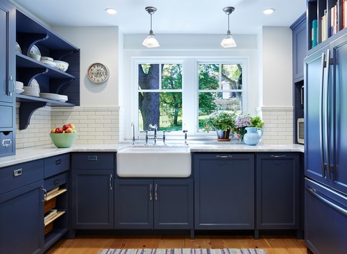
Photo by Meriwether Inc - Browse kitchen ideas


I like this one too!  The moody blue cabinets with the simple subway tile is really striking.  And the farmhouse sink looks fantastic!  


But it's still a bold choice.  So I reached out to all our followers on Facebook and Instagram for their input.  And I got a LOT of feedback!  With well over a hundred responses, there was a very clear winner!  Drum roll please - the winner is blue!!  By a huge margin!  So obviously I'm not the only one feeling bold out there.  And in reality, when you have a home this close to the water, blue is always a good choice.  It just doesn't go out of style.

We did get quite a few suggestions for doing a combination - like white on the walls and a blue island.  But we've been there - done that (albeit a pale blue)!  This is a kitchen we did a couple of years ago with the mixed cabinetry, and it's gorgeous, but I want to try something completely different.   
Photo:  Jamie Salomon

But before I get too carried away, let's talk about the design for our kitchen.  Our starting point was a very tight 'U' shaped kitchen.   This is great for a small apartment or a single-cook kitchen, but doesn't work as well for a family.  Notice there isn't a dishwasher.   Or a refrigerator - it was around the corner in the entryway. Yikes!   I want to change all that!
Original Kitchen
So the plan is to create an 'L' shaped kitchen.  By closing off the old entryway we can move the stove and refrigerator to the long side of the 'L'. (and no more fridge in the hallway entrance!!)

The sink stays in the same spot, but the other appliances go on the long side of the 'L'.

We'll also add an island which will provide space for a couple of bar stools - and also room for the microwave.  I always like to try and hide the microwave!!

What else?  Well, I want to do a farmhouse sink.  And I'm thinking about a marble backsplash. The stove hood?  I still haven't decided.  Still so many decisions required!!!  But this is already starting to feel like a nice, workable design!

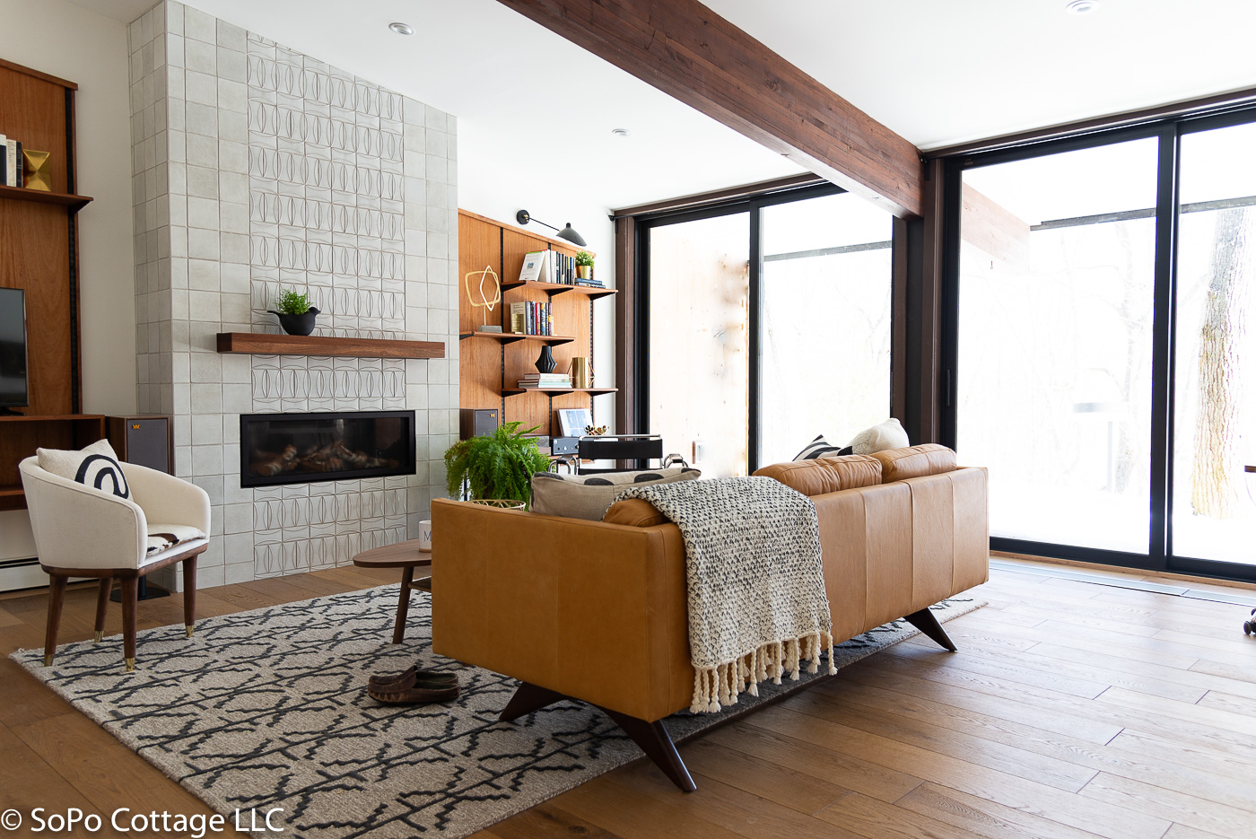
And finally, to pull off a dark blue kitchen, we need to have a room with a lot of light.  Thanks to removing the walls and inserting a new load-bearing beam, the whole living space is now flooded with sunshine all day long.  The blue kitchen will be nice and bright!
Before - dark kitchen with 2 north facing windows.  Now - light and bright!!
Thanks so much for all your input.  I've got to go get those cabinets ordered, so we can stay on schedule!


Pin It

Wednesday, March 20, 2019

Mid Mod Reveal - The Guest Suite

Meanwhile, back at the Mid Century Marvel project, I finally completed the guest suite.  This room started as the original master suite, but we decided to move the master to the end of the hall, away from the rest of the bedrooms.  That way when the whole family comes to visit, they can all be together (code for keep the little ones and their parents in close proximity!).

The room started with some great features.  Double closets along the left, a large skylight and an adjacent walk in closet and bathroom.

But there were some things we wanted to change.  We didn't need the mirror feature above the bed (but I did want a feature wall!).  The wall-to-wall carpeting had to go. And am I the only person out there that has never wanted a bidet???

The bathroom needed an update.  Yes, it's VERY cool that this is a 1968 vintage toilet, but you have to squat really, really low to get to the seat and it uses gallons of water with every flush.  

For the new design, we left the double closets and skylight (although we replaced it with a brand new one, when we redid the roof).  The windows, which did not meet fire code, were replaced with a new egress approved version.  And seriously, it made so much difference!  The skylight provided a lot of light, but the larger windows make it feel connected with the outdoors. 

And for the feature wall?  Well, I went bold!!!  A BLACK wall!  I can't remember where I originally saw this idea, but I couldn't wait to try it on our project.  It adds some drama, but with all the light in the room, we can totally make it work.
Guest Suite - Before
Black Feature Wall in Bedroom
 

The room still has two huge closets - don't you love the awesome MCM door pulls?  I've started stripping the paint off, to return them to a natural wood finish.


And I love this half bath.  The turquoise toilet and bidet were quite the statement pieces, but it was time to update with water efficient fixtures (less than 1 gallon per flush!!!).
See what a difference the new windows make!!  So light and bright!
I loved this tile from the moment I saw it.  But I had no idea how challenging it would be to install!  It was mesmerizing, in a keep-staring-at-it-until-you-can't-see-straight kind of way!  But I still love it!!  


The view from the corner to the hallway really shows how much has changed.

Bedroom with Black Wall


And I love this sweet chair.

Family and friends are already booking their stays!!!  Can't wait to give this guest suite a workout!
Black Wall Bedroom

Pin It

Tuesday, March 12, 2019

Storybook Cottage - The Renovation Plan

After spending way too much time with my trusty CAD program, I've finally come up with a design for the cottage.  I tried several different approaches, because this house had some challenges.  It's a bit like working with a jigsaw puzzle - you do the outlines first and then work your way in.  And after a few false starts,  I'm pretty excited about the final design.  It should be lovely!

Let's take a look at the starting point.  This house has had very few updates over the years and while that has a certain charm, it also makes it less livable for a modern family.  The in-your-face refrigerator as you walk in the door, the cramped kitchen and vintage cabinetry are ready for an update.  And most buyers want an open floor plan - one that blends the living spaces seamlessly so the family can spend time together.
Kitchen - Before - walls block sunlight from the south/west exposure

But it also has some fabulous features.  The first floor ceilings are high, which is a huge plus.  There are a lot of windows and with a south/west exposure in the living spaces, it's bright and cheery.

3 Season Porch
The three season porch and entry porch can become living space - which will be a great addition.  The previous owner used to spend time on this porch every day, even in winter it's such a pleasant room with the sun shining through the windows!

So what's the plan?  We'll eliminate the old, seldom used entrance to the house. That makes the living room bigger and brings in lots of sunlight.  The new entrance will be on the porch - which is also right next to the big 2 car garage.  Much more convenient when you're coming home with arms full of groceries!

The porch will also provide space for a new home office.  Since so many people work from home these days, that's a feature that many buyers want.

As you can see, the main living space will be completely open.  With all the walls removed, sunlight will come flooding into the space.  (as an aside - I tried switching up the kitchen and dining room - but the space just seemed awkward, so we'll be leaving the rooms in their current locations)
1st floor bedroom & bath with interior walls removed

All the walls in the bedroom/bath are being removed and we're starting from scratch.  We've torn out the ceiling and both rooms will now have a beautiful cathedral ceiling.  The bedroom will be larger, so there is plenty of room for a double or queen sized bed.  And the new bathroom will have a large shower.


2nd Floor:

In an unusual move, I'm changing this house from a 4 bedroom down to a 3 bedroom.  As I played with the second story, I just couldn't come up with a workable solution for 3 bedrooms.  I didn't want to have to walk through one room to get to another - and those two rooms were tiny. And if I added a hallway, it made all the rooms even smaller.  So instead, we will have 2 nice, large rooms.

I love the clawfoot tub in the bathroom, so we'll have it resurfaced and add a faucet set with a hand held shower.  Charming!!

Source:  Andraya1123farmhouse
And what about decorating style?  While it was fun to do a mid-century modern home, I'm going back to my cottage roots for this one.  We'll mix vintage elements with modern amenities.  Here are a few inspiration pics that I've been noodling over.
Source:  Concrete Cottage


I'm always a sucker for reclaimed lumber, so I'll wrap the new structural beams in the living room and 1st floor bedroom.


I'd love to do a built in mud bench and shelving in the entryway, just off of the kitchen.  It would provide space for winter boots - and sandy shoes when summer finally gets here!


Photo by Venegas and Company - Search kitchen pictures


The upstairs bedrooms have sloped ceilings, so I want to highlight them!   I'd like to do a vintage style room, maybe with handmade linens.  This one from Miss Mustard Seed is lovely!

But before we get to all this fun stuff, we need to get some work done!!  Stay tuned for all the updates!

Pin It

Thursday, March 7, 2019

Mid Mod Marvel Reveal - The Den

My biggest fear when we started designing the interior of this house?  How to give it character and not look like all those other houses that flood Instagram and Pinterest - with their miles of white walls, red oriental runners and satin brass finishes.  They're lovely, but we want a bit more character.  

And quite simply, I find many contemporary homes cold and sterile. Sure, I love the clean, simple lines of mid-century modern design, but we want our home to feel warm and welcoming. A place you want to sit and put your feet up. So that is the challenge! (Hmmm....can I still have piles of pillows on the sofa?)   

So the first room to come together is the den. It started as a great space, with 2 large sliding glass doors opening out to the deck.  


This room also had a lot of squirrel damage and dry rot, so we had to replace electrical, some framing, drywall and of course we installed brand new sliding glass doors, to improve energy efficiency.

Originally, the large back wall was covered in cork, which was a great feature.  But we discovered it was faded and harbored the smell of cigarettes.  Remember, when this house was built, smoking was the norm (my Aunt Angel said every toddler needed to eat at least one cigarette butt - it was a rite of passage!!!), but it's a tough smell to eliminate, so we removed the cork (which also let us do the repair work behind it!). 


In its place, we added a gas fireplace.  We've had gas fireplaces in several houses and love the warm ambiance they provide on a cold winter night (and let's face it, we have a LOT of winter nights in Maine!).

I tiled the entire fireplace surround in handmade tile.  I remember this pattern from my childhood and absolutely LOVE it!  It was a bit of a challenge to install, but I'm really pleased with it.
Look at that handmade 3D tile!!!  Swoon!!!!

Photo:  Finn Juhl

On either side of the fireplace, the guys custom built bookcases, to match the pitch of the ceiling.  These were inspired by the bookcases of Finn Juhl, the mid-century Danish designer.  We finished them in teak oil, which makes them practically glow!  We love the warmth that the wood casts into the room.  And it gives Richard a place to put his turntable and store his albums.  He's planning to spend a lot of time in this room!

I love how the room looks from the dining room - quite a change don't you think?  Oh, and we eliminated the bifold doors, when we found space for pocket doors in the walls!!
Den 'Before' -  with bifold doors, shag carpet and cork wall
Den 'After' - with white oak floors, fireplace and custom bookshelves

For those of you that follow along on Facebook or Instagram, you probably saw the Wassily style chair that a dear friend of mine found for me in an antique shop near her.  It's a great accent in this room and was worth driving across 5 states to meet up in a diner parking lot to get it!

Vintage chair is a perfect addition
And while we're thrilled to have a mid-century modern home, we couldn't bear to say goodbye to some of our 19th century paintings.  So we've hung our favorites in here, that way we can continue to enjoy them (our dog Petey likes them too!!!)


So what do you think?  Did we hit the mark - a warm inviting space to kick back and relax???  

Stay tuned for more.  We're making lots of progress and I hope to share more 'before and after' photos soon!


Pin It
Related Posts Plugin for WordPress, Blogger...