Wednesday, November 28, 2018

But Does it Look Like Formica - Conundrums of Designing a Mid Century Kitchen

My mid-century roots started with my parents sofa - check out that fabric!
I've designed a lot of kitchens over the years, but never one with mid-century styling.    But I got to thinking - I grew up with mid-century kitchens, maybe they could provide some inspiration? Just look at that MCM fabric on the sofa when I was a baby.  That's the real thing!

The earliest kitchen I can remember from my childhood was in the late 60's in Maryland.  It had metal cabinets that my mother painted turquoise and stainless steel countertops that she would scrub with Ajax every night after dinner.  The smell of Ajax (does anyone still use Ajax??) still transports me back to that kitchen!!!

Yup, this was our stove with white push buttons on each side


Our next kitchen was around 1970 (Colorado).  It had a turquoise stove (she really loved that color!) that had white push buttons along either side for the high-medium-low settings.  It also had white Formica countertops with little flecks in them.

This was followed by a galley kitchen in 1974 with boring brown cabinets and Harvest Gold Formica countertops.  They looked fantastic with the Avocado Green appliances and matching shag carpeting throughout the house.
Dad carving the Thanksgiving turkey circa 1974
Just take this Brady Bunch kitchen and swap out the Burnt Orange counters with Gold and you've got it!
Source:  Hooked on Houses
This was a big color departure for Mom.  Farewell turquoise - hello mid-century trinity!!
Okay, on second thought, maybe those kitchens won't provide the inspiration we need.  I really don't think I want to use any of those ideas and I still dislike that color palette!  The only idea that might have some merit is the countertops....hold that thought......there may be a kernel of design inspiration there.

Now here's the conundrum.  We want to stay true to the mid-century design intent of the house.  But we really don't want a slavishly mid-century kitchen.  And I'd like to stay away from bold colors on major elements like cabinets and appliances - we can do a lot with accessories to introduce color (so forget about that turquoise or avocado green stove!).

So I started reading and pinning and coming up with ideas.  And I found some pretty great inspiration!

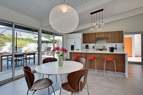
This kitchen has a lot of elements that appeal to me.  Maybe because we have a similar ceiling line and big sliding glass doors.  I also like the mix of the dark and white cabinetry and a big, dramatic light fixture.

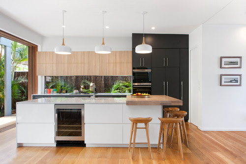
Or this one, again, with dark cabinets mixed with white.


This is also a nice inspiration.

And so the design started to take shape.  We taped it out on the floor and the walls, to see if it would be comfortable for us to work in.  And after a few tweaks, we were pretty happy with it.  (You'll notice the pipes sticking out of the concrete floor.  That's where the plumbing was laid under the concrete in the original kitchen and to keep things simple, we will be leaving the kitchen sink in the same spot.)  And the tall pencil line you see on the back wall??  That's going to be a giant window that will provide some ventilation and a view of the courtyard.

First and foremost, we're going to use dark slab front cabinets (solid quarter sawn oak, stained walnut) for the base and around the refrigerator and white cabinets for the uppers.  I know you see a lot of veneered cabinet fronts, but we wanted to stick with all wood.

I'm still agonizing over hardware.....I like the sleek look of no knobs at all - with pressure latches - but think that might be awkward (and would we have shiny spots where we pushed to open them all the time?).  So maybe some slim, finger pulls?  Hmmm.....   Thankfully I don't need to decide that for awhile.


The island will have seating for 6 (count em 6!) people!!  I love having a place for friends and family to gather around.  We do a lot of entertaining and since everyone ends up in the kitchen anyway, this will be a big space for a crowd.


And since the kitchen connects to the bar and the mudroom, we've included them in the design.  We will put giant, 8 foot tall pantries in the mudroom.  This will give us a lot of additional storage.

The Bar cabinetry and wine fridge
And we're going to use the original bar sink for the bar and add new cabinetry and a wine fridge in there.

Finally, I want to include an accent for the backsplash.  So behind the range, I'll be installing this amazing tile from Walker Zanger.  It caught my eye when I first saw it.....and when I looked it up online I discovered it's part of the Stardust pattern.  It pays homage to David Bowie's Ziggy Stardust character and is inspired by 1970's interior design.  Seriously???  It's perfect for our project!!
Photo:  Walker Zanger
Once we decided on the cabinets and backsplash, we needed a countertop.  And as I started doing more reading and research, we realized that something that looks like the Formica of my childhood would probably fit the bill.  But we want to use a quartz product, to make maintenance easy.  After looking at different options, we decided on this quartz called Winter Storm.  It ties beautifully with the backsplash, but has enough speckles in it that it won't show every single crumb.  For the tall counter in the seating area, we're debating butcher block or stainless steel.

The last piece of the puzzle is lighting.  With our tall ceilings, we want something that's a bit of a 'wow' from a mid-century perspective.  Richard and I spent a ridiculous amount of time on this, but finally found something we both liked -  a sputnik style fixture (hmmm....maybe that ties to the space exploration theme of the tile!).  Now, the basic rules for choosing lighting is to add the number of feet that make up the length and width of the room - and take that number in inches as the size fixture you should look for.  In our case, that is 15 feet plus 20 feet = a 35 inch diameter fixture.  But with our tall ceilings, I was worried it wouldn't be big enough, so I made my homemade sputnik - which looks a bit like a kid's bad science project - and hung it up so we could check it out.  Seems silly, but it made us confident enough to order the fixture.
My pathetic science project!!  Sputnik light fixture mock-up!!
How will it all come together???  This mood board captures some of the elements.

Now the cabinets, appliances and lighting are on order and we're ready to go!  Hopefully we have captured that mid-century vibe, but with some modern elements as well.


SaveSave Pin It

Tuesday, November 20, 2018

Mid-Century Demo Day

Demo Day is always exciting, but it was a bit different in this house.  Unlike most homes, where we are tearing out lots of walls, we want to keep most of the original structure in this house.  In this house we're concentrating more on finishes and fixtures and investigating some potential problem areas.

So what were we worried about?  Well, this house was built back before a lot of modern insulation and air sealing became popular.  And with an indoor garden area, there was a high level of moisture.


As we started peeling back layers, our concerns were verified with patches of mold and mildew.  I have asthma and found that I couldn't enter the basement without an asthma attack, so I wasn't surprised when we found mold and mildew on the back of drywall and carpets.  We removed all organic material from the basement and I was immediately able to breather better!


See the black areas?  Squirrel latrines! 
Another concern was squirrels.  The house is surrounded by mature oak trees and there are acorns everywhere.  We had seen evidence that they had chewed their way into the house and we quickly discovered squirrel nests and acorns in a couple of spots.


There is a pocket door frame in there!!
But we found some nice surprises as well.  We aren't huge fans of bifold doors - like the ones between the dining room and den - but we thought we should keep them because they were original to the house.  So we were thrilled when we discovered the house originally had pocket doors between the two rooms.  We will restore them with new doors, that can disappear when not in use!

We want to update the kitchen and bathrooms, so took them back to the studs.  That allows us to update the plumbing & electrical, before we put new fixtures in.


And as usual, we donated everything we could to Habitat for Humanity's ReStore.  We practically filled the garage with the donations!  

And of course we saved a lot of the original items, to return them when we've finished the updates.  I love the waterfall butcher block counter from the kitchen, so that is safely stored away.  

We kept a lot of the special items - like lighting and this super cool phone,


medicine chests, faucets and my favorite - the laundry room roll away basket!  Is it crazy that I love this stuff so much?

Now the real work begins, putting the house back together again!


Pin It

Tuesday, November 13, 2018

Mid Mod Marvel - Game Plan, Part 1

This is going to be a fascinating project and a major change from our usual approach.  Typically I take out lots of walls to create an open floor plan, but we already have those elements and need to change our focus. So what are our design goals?

First and foremost, we want to maintain its Mid-Century origins.  There is something really special about this house and we want to stay true to the original architect's intent.  Sure, this isn't a house that's on any list of historic buildings, but it's still notable for its time and was designed by a well known architect for his own family.  We want to honor that design going forward.

So as we got started, we were lucky enough to meet with James Schwartz, former editor of Preservation (the magazine of the National Trust for Historic Preservation) and President of the Board of Maine Preservation.  With his extensive background in preservation, we knew he would be a wealth of knowledge and could give us some guidance.

He talked first about generalities of mid century design.  There were several hallmarks of the era that all exist in our home.  First, the emphasis on melding interior and exterior spaces.  The large wall of windows to the deck - with a tree growing right through it - is a perfect example.


Next was the dynamic facade of the house.  The angled siding is unusual and really makes a statement (but I have to note that from a building and water management perspective, it's a nightmare to manage.  As usual, the guys think I'm crazy to want to keep it in our design!)  As does the large bubble window that juts out over the front walkway.  We should keep those elements.

He also talked about how this period saw the kitchen as the center of family life.  Previously, the kitchen was relegated to the back of the house and was really just for the cook. Mid-century design changed all that and this kitchen is a perfect example - it really is the heart of the house.  There is a lot of room for the whole family to cook, eat and spend time together.

Another feature was the use of soaring spaces.  The big vaulted ceilings, the tall indoor fireplace and the open sight lines are all hallmarks of the period.  That's something we love about the house and don't want to change.  Just look at those beams!!!  And the chunky handrail for the staircase!

The sunken bathtubs need to go - a broken hip waiting to happen!
We also discussed some of the changes we want to make - we will add a couple of windows on the front and back of the house to increase sunlight and ventilation.  And switching out the line of bedroom windows to something that meets fire code - 'egress' windows that allow a firefighter to enter the building with a full pack.  We also want to update the kitchen and bathrooms with fixtures that are more energy efficient and meet modern living standards.

He stressed that we need to remain sympathetic to the original design - but that it's expected that houses will evolve over time to meet modern life.  As long as we stay with the original design intent, we will support the style and livability of the home.

With that information, we started playing with ideas and floor plans.  After several iterations, we settled on a go forward plan.


So here's the 'As Is' floor plan.  As you can see, the original design has open concept living, with the kitchen at the center of the living space.


And here is the 'To Be' floor plan.  Not much different!  That's because we are keeping so many of the original elements.  The living spaces will stay the same, including the chunky stained wood trim and the fantastic fireplace.  But we will be replacing all the windows and skylights, to more energy efficient units.


The bar will stay - including this amazing cocktail wallpaper, that I dearly love (I'm pretty sure I can clean it!).  But we will open up the opposite wall of the bar, to give it a bit more light and create a way to chat with the bartender
 (Richard is looking forward to having a dedicated bar!!).

We will rearrange the kitchen a bit, by removing the long, room-dividing countertop and will extend the current center island.  We will also add a tall window at one end, to provide a view to the courtyard garden in the back of the house.  It's a lovely feature and we want to highlight it.

And while we love the idea of an indoor garden, from a building science perspective, it doesn't make sense as we tighten up the building and add insulation.  The moisture from the pond and garden would create opportunities for mold growth.  By removing the garden, it will give us the opportunity to add a staircase from the kitchen to the front door - something the architect said existed when the house was first built.  That staircase will give us great circular flow - perfect for a party house!  But in the meantime, I'm attempting to save the rubber tree plant, which I'm hoping we can transplant with cuttings from the original.


Another area that will see updates is lighting.  The current house doesn't have a lot of lighting.  For example, the long back hallway doesn't have any overhead lights, just this row of path lights around knee height.  We LOVE them and intend to keep them, but we want some additional lighting as well.

Giant, non-energy efficient spotlights are used in the living room.  They throw off an amazing amount of heat when they are on, so they are not the tiniest bit energy efficient.  I'm not even sure we could find bulbs for them anymore, so instead we will be installing LED recessed lighting throughout most of the house.


The bedrooms all have awning windows, which don't meet modern safety standards for egress (a firefighter needs to get through the window with a full pack - requiring 5.7 sq ft of opening window).  As you can see, they only crank out a few inches. We will be updating all the windows to meet building code.
Bedroom awning windows don't meet modern fire codes
The other big change is switching the master bedroom from the center of the house to the large bedroom at the end of the hall.  It has a big sliding glass door that goes out to the courtyard.  And we will add a new master closet and bath.
Future Master Suite
We will also add a powder room for guests and renovate the hallway bathroom and laundry room.
Future Bunkroom for Grandkids!

One of my favorite projects is to repurpose the smallest bedroom to become a 'bunk room' for our grandchildren when they visit.  They're still a bit too small to sleep in a top bunk at the moment, but as they get a bit older, we think the bunk room will be a big highlight for them!  We're also hoping that means they will visit more often!

And of course we will address all the energy efficiency elements.  We'll be replacing the boiler with a new, high efficiency propane unit.  We're also adding a LOT of insulation, new windows, new doors, energy star appliances, etc.  That will make a world of difference from an energy consumption perspective.

Finally, this is the plan for the interior, to allow us to move in as quickly as possible - hence the Part 1 plan.  The exterior (Part 2) also needs a lot of attention, but will have to wait until next year.

So with a plan in hand, we can get started.  Of course we fully understand that a plan is just that - we're bound to find surprises and issues that require modification.  But that's all part of the process.  I hope you'll follow along, this should be an interesting journey!

Pin It

Tuesday, November 6, 2018

The Mid-Century Marvel

Mid Century Modern?  Yes Please!!
If you've been following us for awhile, you know that we've been dying to do a mid-century modern renovation.  And just when we thought we'd never find one, the perfect home came on the market. (why mid-century?  See this post).  And in a major departure from our usual approach, this home will be for us to live in!

Why would we want to move?  We have a fantastic home with spectacular water views and every SoPo Cottage detail we could think of.  And like lots of people, when we became empty nesters we downsized to a smaller house.  There were so many pluses - less maintenance, purging decades of stuff, and a lovely space just for us!  But we've found that running a business out of our home takes a LOT of space (not to mention that we've longed for a garage during our snowy winters).  And as our family expands (we now have 3 grandchildren with promises of more to come), we find we need more room.  So we've been quietly looking for awhile.  And from the moment we saw this house, we fell in love with it.  It's an amazing place!

Since this will be our own home, I've thought long and hard about whether to share via social media.  There are pros and cons to sharing.  But it's such an interesting home, I thought people would want to hear more about it.  And I know it's not our usual cottage style, but it's pretty exciting!

So here it is.  Built in 1972, by a famous Maine architect, John Leasure, this home was the perfect mix of modern and contemporary when it was built.  And since it was Leasure's own home (they lived here with his family for almost 50 years) it has a lot of features that were ahead of its time.  What do The Brady Bunch and this house have in common?  Well, they are both from the 70's and families with six kids!  Not to mention lots of 'modern' architectural design features.

For those of you who are local, you've probably seen Leasure's other works, including the tallest building in Maine (Franklin Towers, on Marginal Way in Portland), the South Portland Library (which thanks to some recent updates, is looking more like Leasure's original design), the Fire Station at Cash Corner, Southern Maine Community College buildings and St. Bartholomew church in Cape Elizabeth.
Photo:  Leasure & Associates
This house shares some of his trademark style, including long, sleek facades, and 'modern' touches of the period including soaring ceilings, lots of natural wood and an open floor plan.  He also made extensive use of concrete in all of these buildings.

And while we love everything about this house, one of our favorite features is the way it's situated on the site.  The house perches on the top of 'ledge' - granite outcroppings that are characteristic of the Maine coast.  Originally, the house had panoramic views of Casco Bay and a lighthouse, but today the views are filtered, as the trees have matured.  And all that greenery, well, it makes you feel like you're in a treehouse!

Let's take a tour!

The first wow moment happens as you step inside the front door.  A large koi pond sits inside, flooded with sunlight from the giant 8x10' skylight.  There is a lot of greenery around the pond, including a giant rubber tree that is so big, it has to be tied up to the wall to keep from toppling over!
The wood burning fireplace is the centerpiece of the house.  We love its sleek lines and how it anchors the large living room.  


The architect did a masterful job planning this site.  The large outcropping of rock (aka ledge) at the top of the hill provided the foundation for the house.  He situated the house on the site, taking advantage of the different levels formed by the ledge - pouring the concrete slab directly on the ledge.  That created the dramatic elevations in the living space.  What do you think of the sunken living room?

A key element of mid-century homes is the use of concrete.  An incredibly cool feature of this house is the massive cantilevered walkway that hangs over the living room.   That's something you don't see everyday!

The dining room is a large room with the original buffet designed and built by the architect.


Next to the dining room is a large den, with a giant cork wall.

But the other feature that grabs your attention is the deck that runs the entire length of the house.  The living room, dining room and den all have floor to ceiling glass doors that open out to the deck.  It really captures the whole indoor-outdoor style that is so typical of mid-century modern homes.  And do you see how the outcroppings of ledge/rock are incorporated?  The entire deck is perched above the ledge and the steep grade below it.


Look at the tree growing through the deck off of the dining room!  How cool is that?

The deck is built around the outcroppings of ledge rock
This house has a large kitchen with lots of cabinetry and work space.  And with this open floor plan, it overlooks the living room and koi pond.
 This large countertop runs the width of the kitchen.  Note the blue shag goes up the wall!


But what 70's house would be complete without a bar?  And this one is fantastic!!  Look at that wallpaper.  That's on my list of 'must keep' items!  I'm also keeping that original bar sink with the built in bottle holders (which also works perfectly as a red solo cup dispenser - oh, we are going to have so much fun with this place!!)
Vintage cocktail wallpaper!!
And since Maine has such cold snowy winters, it's important to have a mudroom to come indoors and shed your boots, gloves and snowy jackets so they can dry.  As a bonus, this mudroom also has a lot of pantry space.


And what about bedrooms?  Well, there are four - all leading off of this long, dark hallway.  I LOVE the lights at knee level, but want a bit more lighting to see where I'm going :-)  
The most notable bedroom - this one with its vintage wallpaper. Bonus points if you can read what it says!
Can you read what the wallpaper says???  
Oh and the wallpaper is inside the closets too!

The master bedroom has a big skylight that floods the room with sunshine.  There is a nice walk in closet, in addition to these closets with their amazing handles!


And check out this bathroom!!!  The fixtures steal the show, but note the narrow tile work.  Fantastic!
These American Standard fixtures were introduced in 1968 - and were the absolute height of modern style.  (but by today's standard, they use an absurd amount of water and you have to squat so low to get to that toilet seat!!!)  The matching blue bidet and sunken bathtub complete the set.


Photo:  Old House Journal
The bedroom at the end of the hall sports the 'bubble window'.  It's actually a round plastic dome, installed vertically, to allow the owner to look out the window and see if anyone was coming up the driveway.  It's such a cool feature!  And this room continues the mid-century shag carpet color scheme - this one is Harvest Gold.

The hall bath is like a time warp.  Floating vanities are suddenly popular, but this one from 1972 is actually a long board, to hide the plumbing.  The metallic wallpaper is so totally vintage!!!  And don't you love the skylight with the wooden louvers?

And note the reading light for the 'throne'!!
The architect told me he wouldn't recommend a sunken bathtub again.  I tend to agree - am I getting old or do other people think this looks like a broken hip waiting to happen???  Not to mention, how do you clean it???  Lay on your stomach to reach the bottom??

And what about the laundry room??  The family raised 6 children in this house, so there was a lot of laundry!!  This room is a dream!  And don't you love that floor?  Again, what was once popular is new again!
I'm really excited about the finished basement.  Originally the architect's office, it has a lot of space for me to set up a SoPo Cottage workspace.  I'll no longer take over the dining room table as my head of operations!  And the sewing machine can be a permanent fixture, I won't be lugging it back and forth from the basement all the time.

The boiler room is pretty interesting.  Again, you can see how the house was created on the ledge.  The large rock outcroppings are built right into the space.

Our whole family came out to check out the new place.  As you can see, it's grand daughter approved!

What are our plans?  Well, we want to maintain all the amazing mid-century aspects of the house.  But we need to update it to meet modern building code requirements - as well as energy efficiency needs (built before the oil embargo of the mid 70's, it has very little insulation).  And since it's our own home, we want to customize it a bit to meet our needs (aka - a bunk room for the grandkids when they come to visit!).  So stay tuned as we share the journey!  This one will be soooooo interesting!

NOTE:  This is still a work in progress!!!  We have passed the one year mark and are still hard at work.  But we hope to share all the 'Afters' when it's done!    In the meantime, you can see lots of updates by scrolling back through the blog.  Also on Instagram or Facebook!


Birds Eye View


SaveSave Pin It
Related Posts Plugin for WordPress, Blogger...