
I've been pulling together different ideas and inspirations for the house for awhile now. My Pinterest, Houzz and dog eared folders (because I still love looking at real magazines & catalogs) started filling up in a hurry! They create the inspiration file that I use for the entire house.

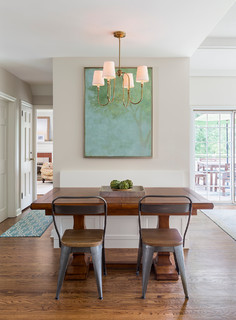
My inspiration file started to show a few clear themes. Soft blues and greens, the perfect colors for a coastal home.. Traditional - but with a modern twist (aka transitional) - I'd like a young and energetic vibe, rather than a sedate, run-of-the-mill colonial. We'll do this with light fixtures, hardware and artwork.
Since the house is in a coastal community near Casco Bay, I really want to include a coastal look in the design plan. So one of the early decisions was to paper the upper dining room walls with nautical charts (note: they're not called maps when they are for water). I love these charts - I've used them to paper a powder room in an earlier project. And we have them in our own home. My dear neighbor supplied many of them - he'd been storing them for decades (because now everyone uses GPS) and they have some creases and notations that just make them more interesting.
With that decision made, the rest of the plan came together quickly. The living room will have creamy beige walls. I sampled 4 different colors and am still deciding which I like the best.

In both the living and dining room, we have these large, graceful bay windows.
I'm planning to use these gauzy Pottery Barn linen panels with blue and white stripes, to frame each side. And the antique brass and satin nickel on the fixtures will complement the colors beautifully.
 We had an amazing discovery the other day. While cleaning out a pile of stuff on the screened porch (because the snow had actually melted for a few days!!), we discovered these anchor andirons. They must have been used before the previous owner installed a wood stove, because they fit perfectly!!! Thankfully, they never threw them away and kept them outside. I can't wait to get them cleaned up and reinstalled!!
Of course I don't even have walls up in a lot of the house yet - so we won't get to this for awhile. The finish line isn't even in sight yet. But it's so nice to step away from the messy stuff for a bit and plan for the end result!
Pin It
 |
| SoPo Cottage Project #2 |
With that decided, it set the color scheme for the house. Watery blues and greens. With a neutral beige to tie it all together.
For the kitchen, I ordered white Shaker cabinets We will do quartz counters and a simple colored subway backsplash. I loved this blue tile....but worried that might be too definitive for future buyers, so I started looking for beige instead.
And then I stumbled across this glass penny tile. In an instant, I knew I had to use it. It picks up all of the colors I'm using and with the swirls of glass, it really resembles water. It's perfect! I'll use it for an inset above the stove. And just forget about that other plan J


 |
| Sherwin Williams - (clockwise from top left) Medici Ivory, Irish Cream, Ivory Lace & Steamed Milk |

In both the living and dining room, we have these large, graceful bay windows.
 |
| Style: Coastal, Transitional (traditional with contemporary influences), Young & Energetic |
 We had an amazing discovery the other day. While cleaning out a pile of stuff on the screened porch (because the snow had actually melted for a few days!!), we discovered these anchor andirons. They must have been used before the previous owner installed a wood stove, because they fit perfectly!!! Thankfully, they never threw them away and kept them outside. I can't wait to get them cleaned up and reinstalled!!
Of course I don't even have walls up in a lot of the house yet - so we won't get to this for awhile. The finish line isn't even in sight yet. But it's so nice to step away from the messy stuff for a bit and plan for the end result!

Your ideas are so nice--I love the nautical charts as wallpaper and the andirons are perfect. I vote for Medici Ivory with the paint.
ReplyDeleteThanks Alice!! And that's the leading contender for paint.....but it's amazing how different the samples look at different times of day and weather conditions!!
DeleteI am loving the use of the charts and the colour scheme!
ReplyDeleteThanks!!! I can’t wait till we get to that stage of the project, so we can see how it all comes together!!!
DeleteLove the map wallpaper idea! Glass penny tiles! So pretty! ����. Wish I had seen this before we put up the bluish glass subway tiles! Beautiful job!
ReplyDeleteI'm doing glass subway tiles in the bathroom - they should be gorgeous! I'll bet yours are!
Delete